Trout Style: Rebrand for web design firm based out of the pacific northwest. Marry the owner’s passion for the digital and natural world through the logo mark and color palette. Leverage what makes the business unique.
Trout Style: Rounded soft forms with the mark and type. The pentagon represents the five tenets of service Imaginary Trout provides and harkens back to the military roots of the brand. The main mark looks to the right and the optimism of the future and new possibilities while reaching out of the water and the past.
The legacy mark has evolved to a more dynamic form with a “J” symbol embedded within it The support marks can be used throughout the site as siginifiers for transitions between sections and achors between the digitial and physical world.
Yin yang between nature and the digital world. Contrast nature and the screen through color and images. Angles and juxtaposition as a transition between themes and images
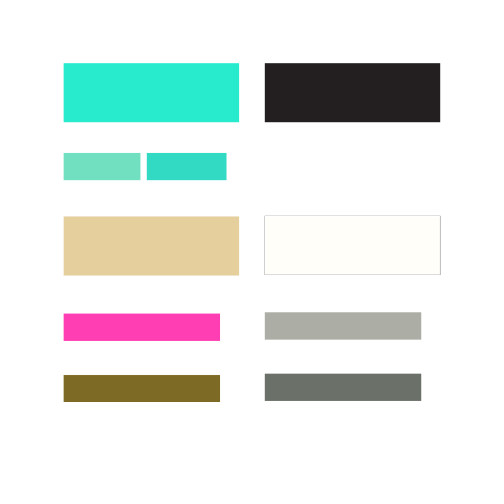
Digital water is the signature color for imaginary trout. It is amplified nature and connects the two worlds of the brand. The white is a slightly warmer tone to balance the harshness of the night fishing and the digital water with support from the river sand to balance the palette The supporting colors provide depth and offset tones to compliment where needed.
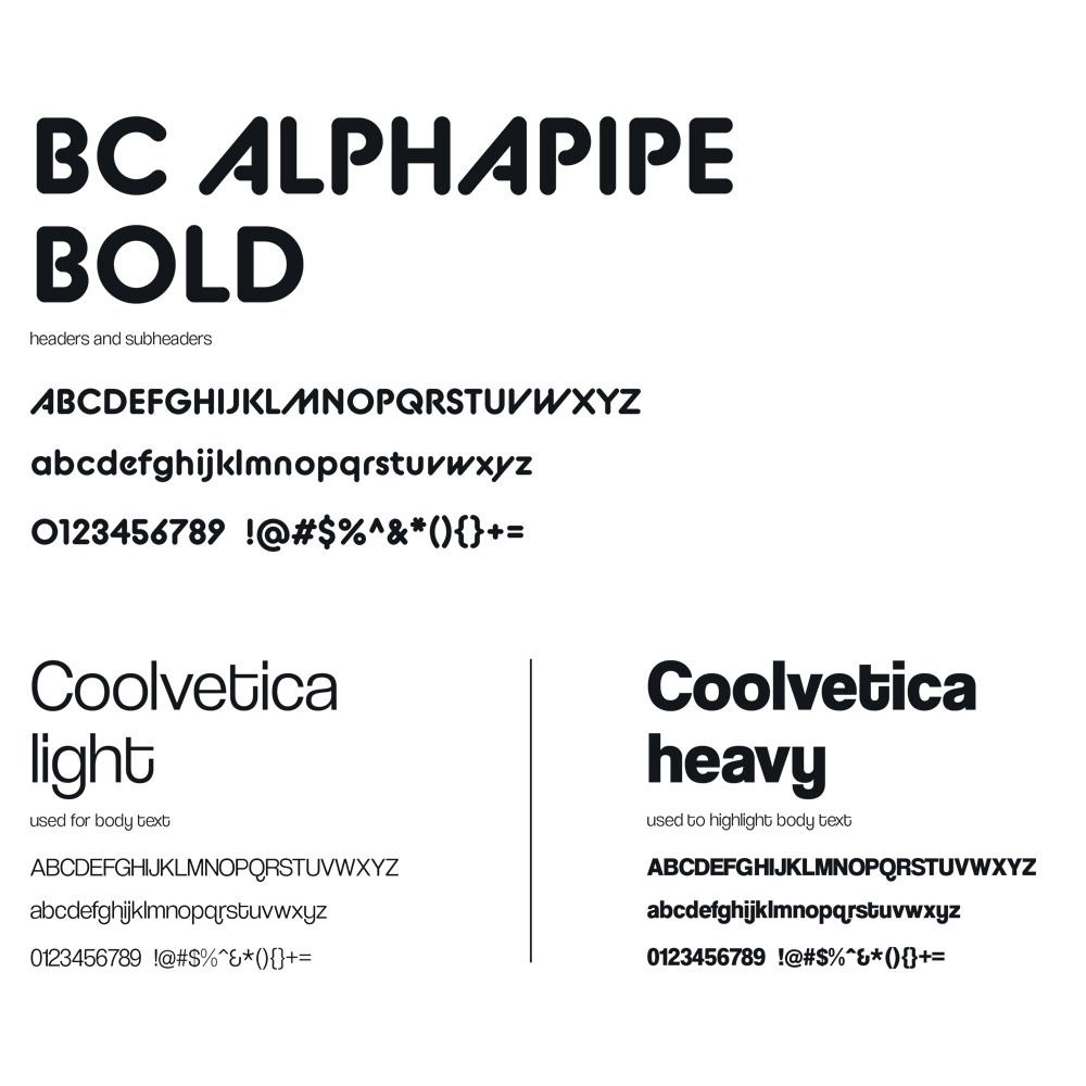
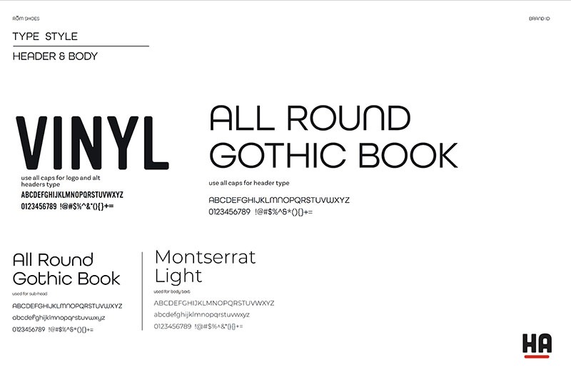
Rounded Welcoming type style with a modern look.
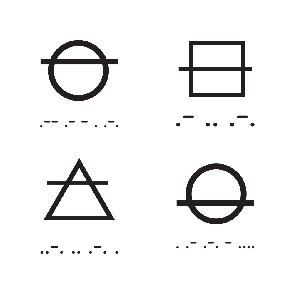
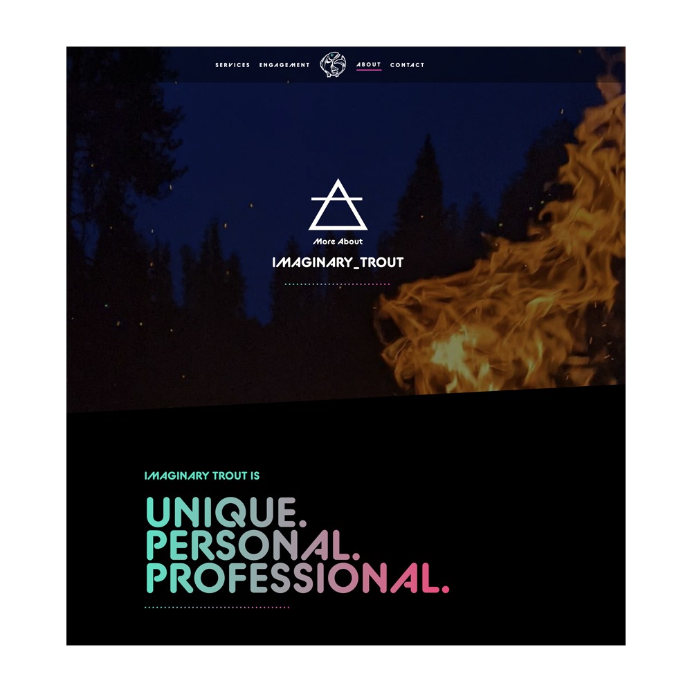
The Elements of Fire, Air, Earth, and Water act as anchor points for the trout brand with morse code below for texture.
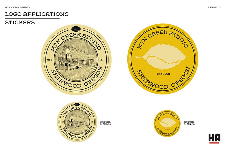
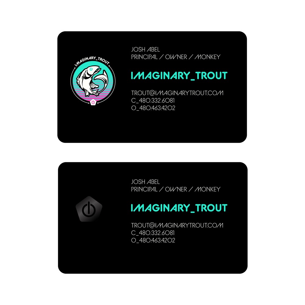
Rounded corners with a premium matte finish and gloss highlights on the front and back. Bold use of color palette to highlight brand on front and logo mark on the back.
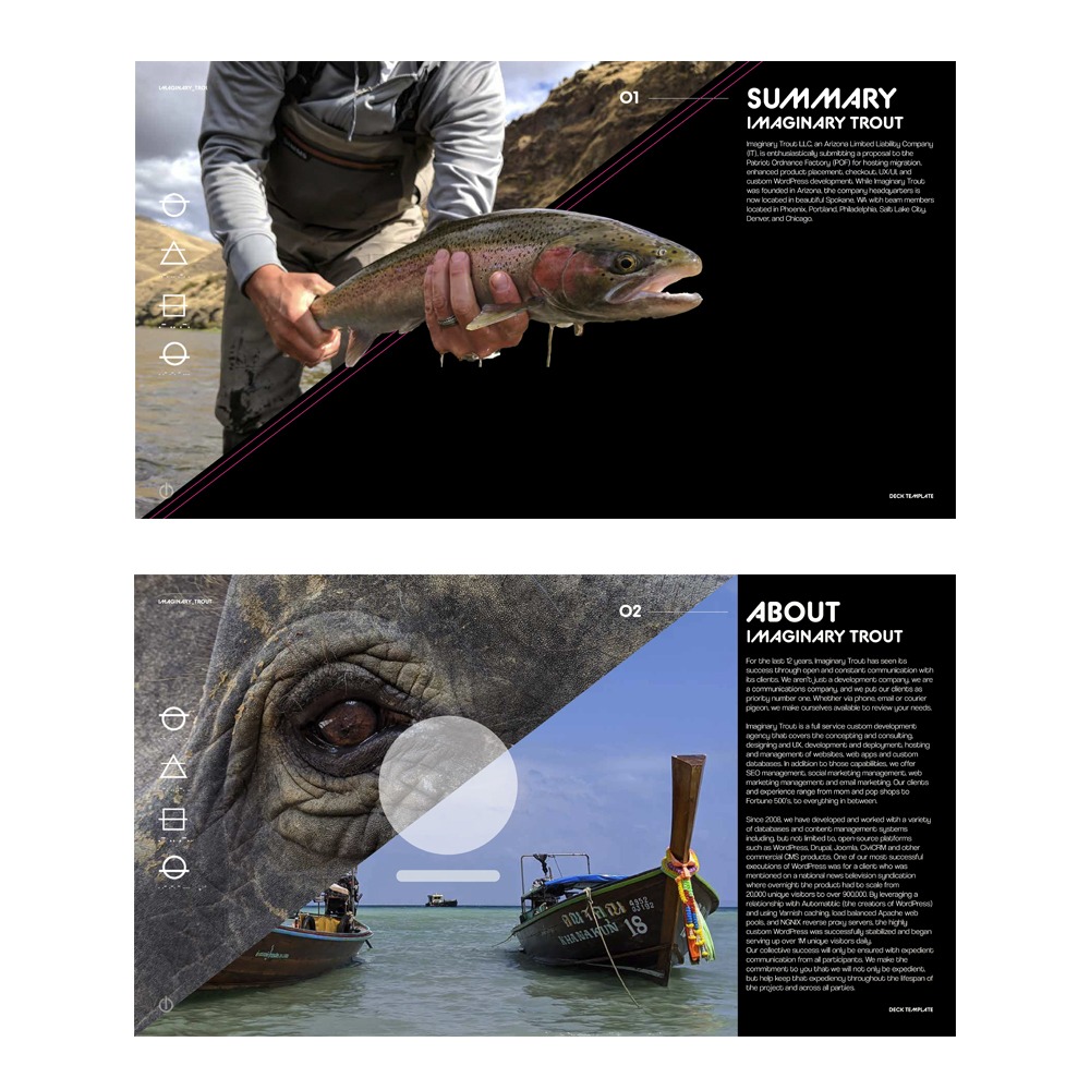
Imaginary Trout’s website utilized the elements to anchor each section of the site and how the images were used. It provided a subtle context for how to display the theme on the site and allowed for better flow between sections.
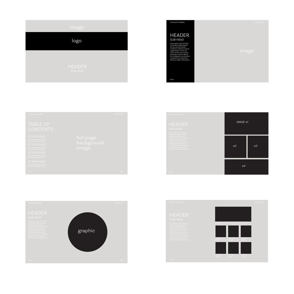
The template needed five distinct master layouts for expression and versatility. A cover, image heavy, text heavy, contract, and work flow. Th rebrand elements help draw the eye around the page and anchor to the brand ethos of the elements and marriage between the natural and digital worlds.
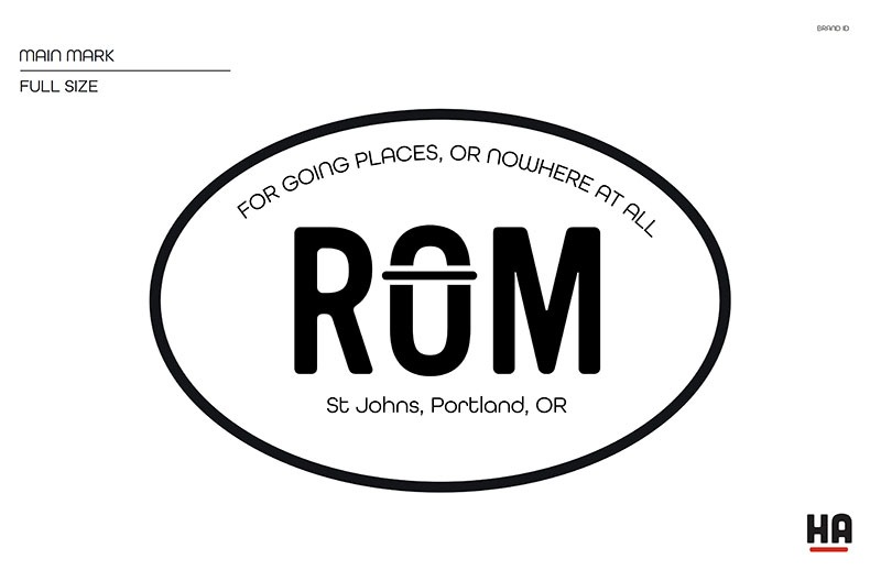
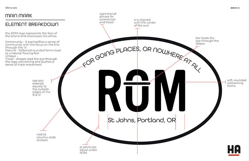
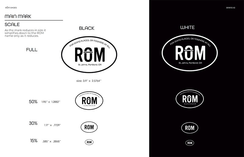
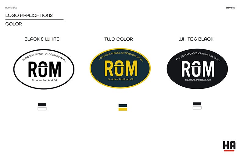
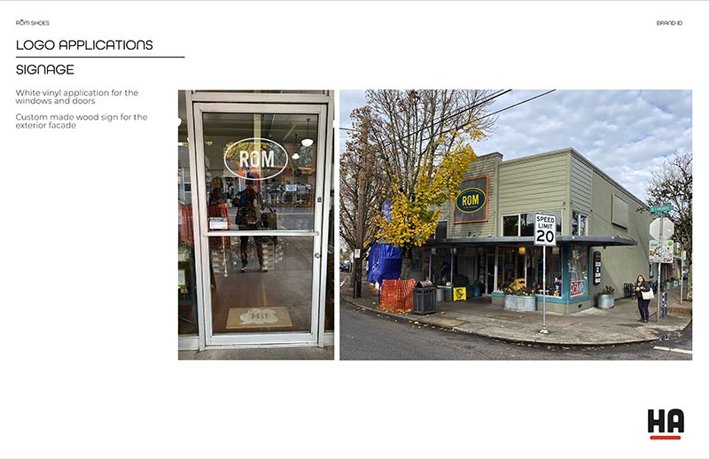
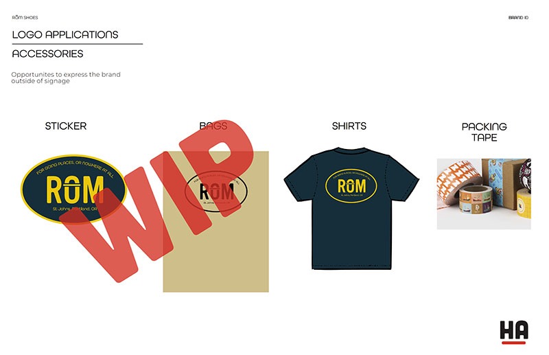
ROM reBrand
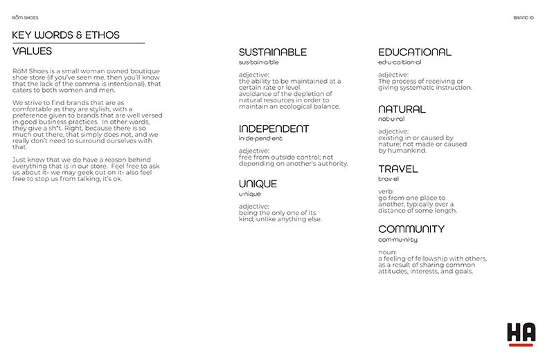
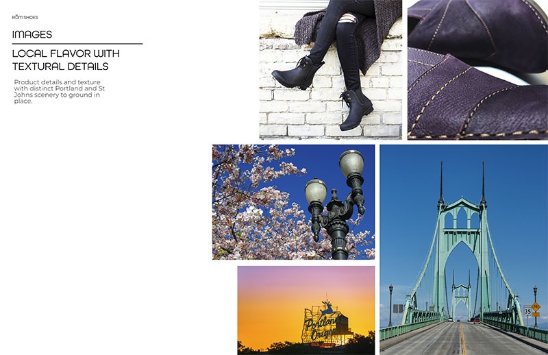
Travel and outdoor clothing and shoe store located in St Johns.
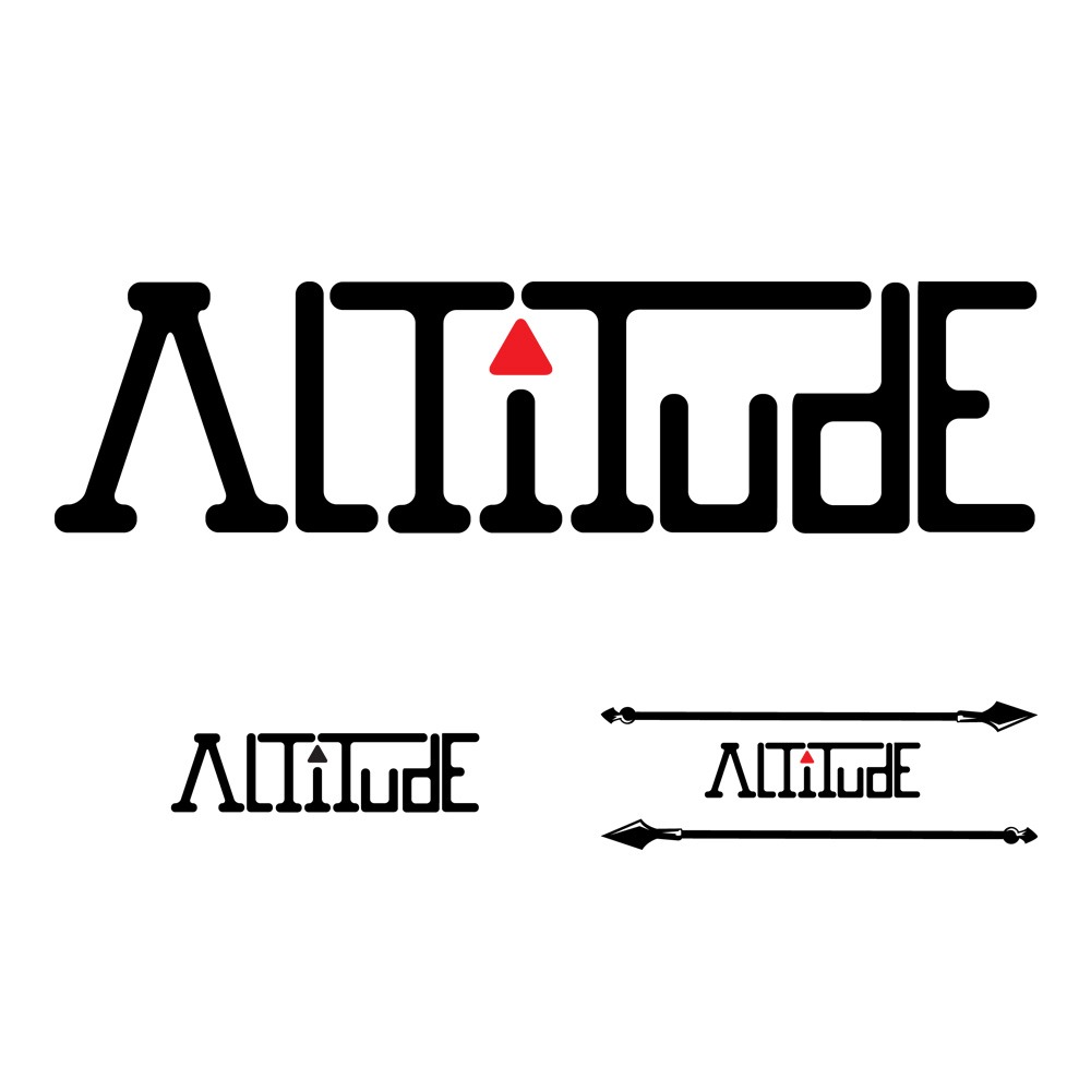
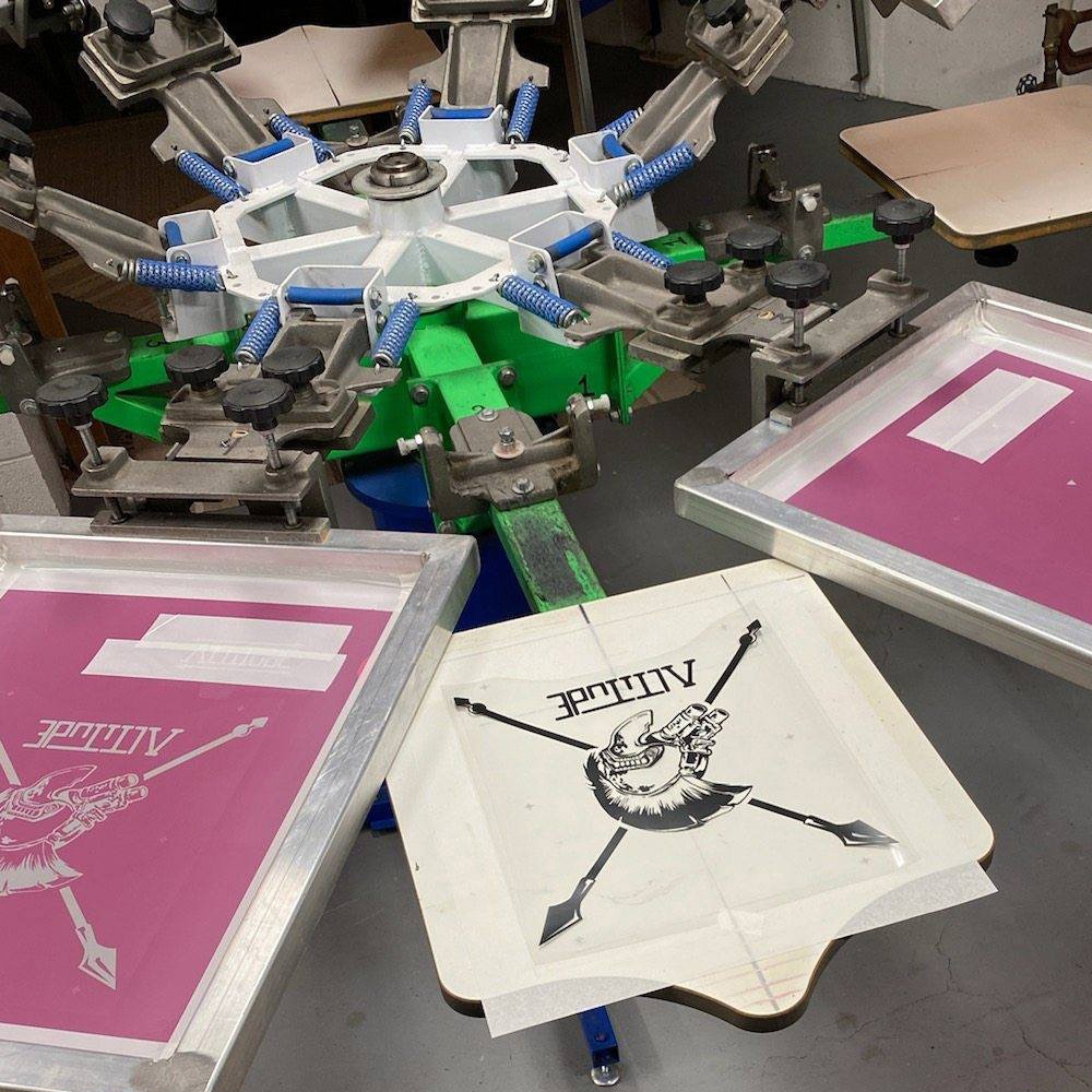
Altitude logo
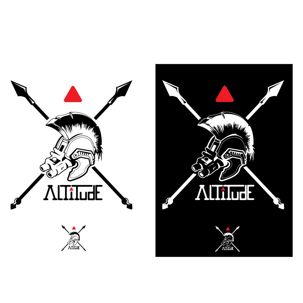
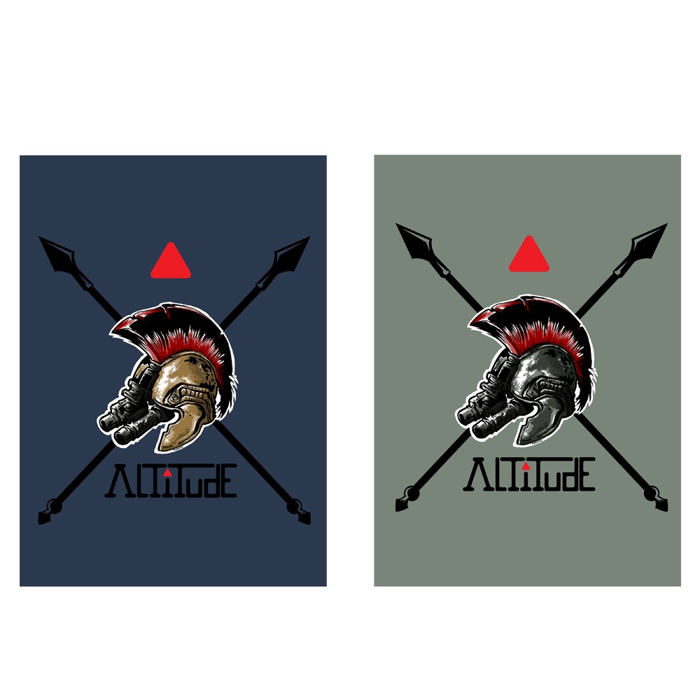
Tactical Risk Mitigation Firm based out of Spokane, Washington
Jack Rosenthal wanted to meld old Spartan helmets with modern military gear for his security company. The Spartan plume with the night vision goggles
Hand drawn letters for the name with the triangle as a symbol of strength. The triangle (with the number three) represents perfectness, unity, and importance. It is the strongest unit.
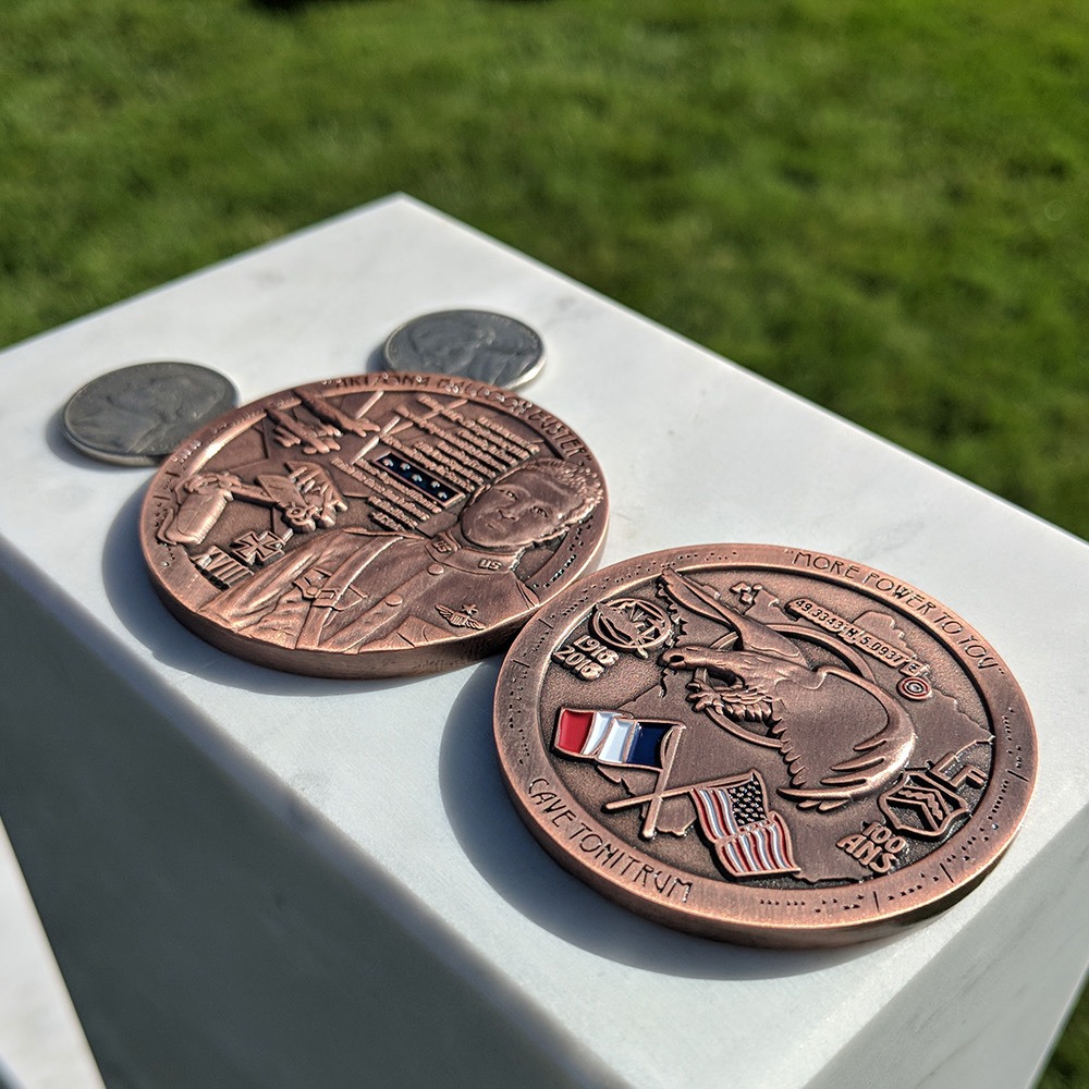
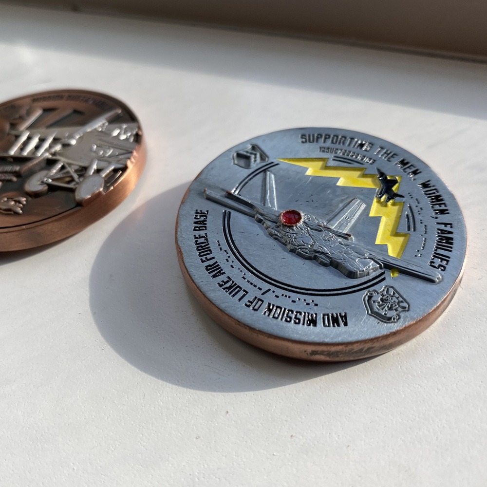
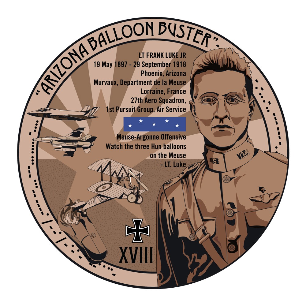
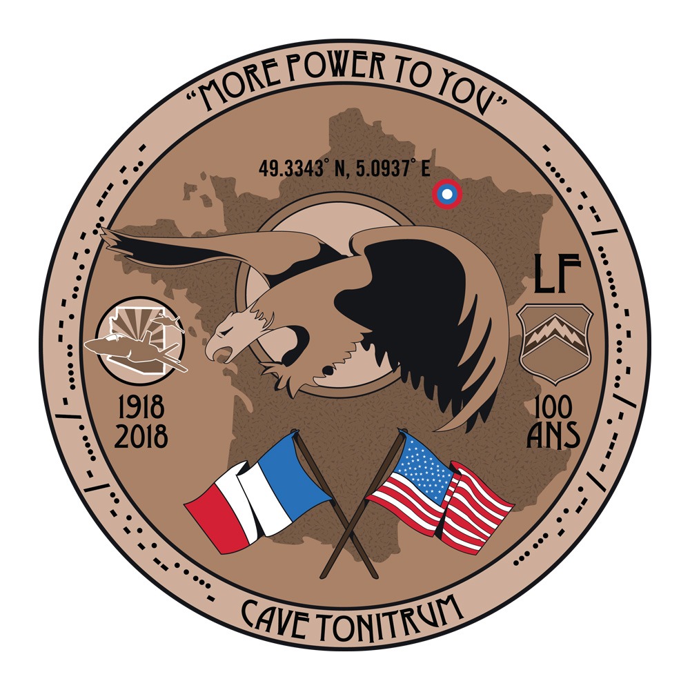
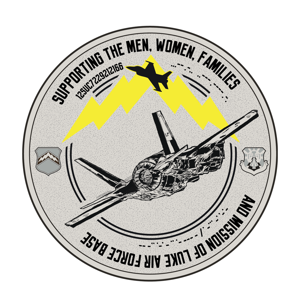
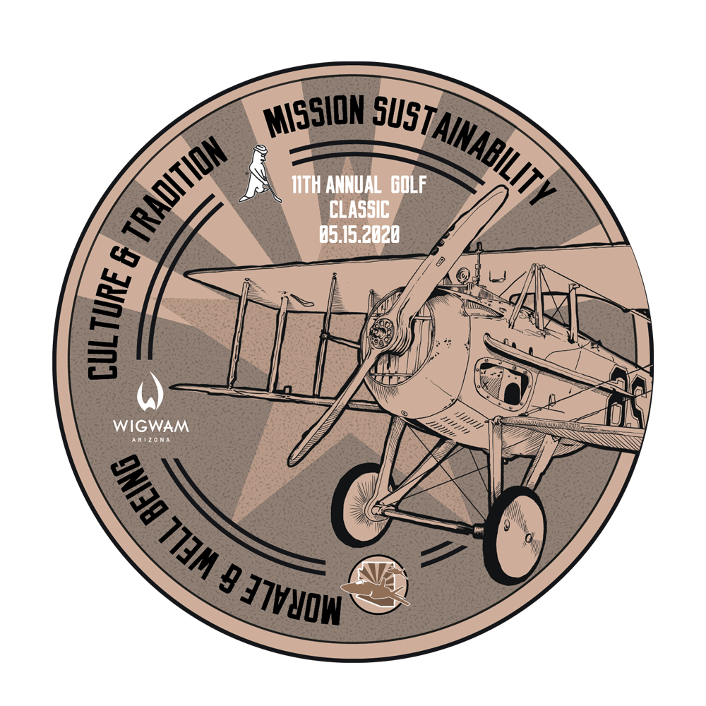
Luke Air Force base coins
2018 – 2021
Challenge coins for LAFB
Celebrating the 100th anniversary of Lt Frank Luke Jr’s death
11th annual fundraising golf tournament for the base.
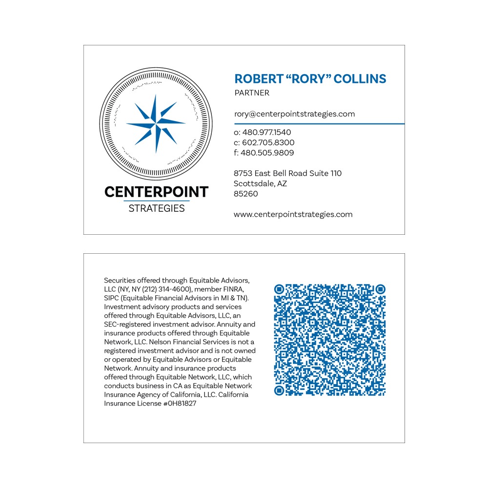
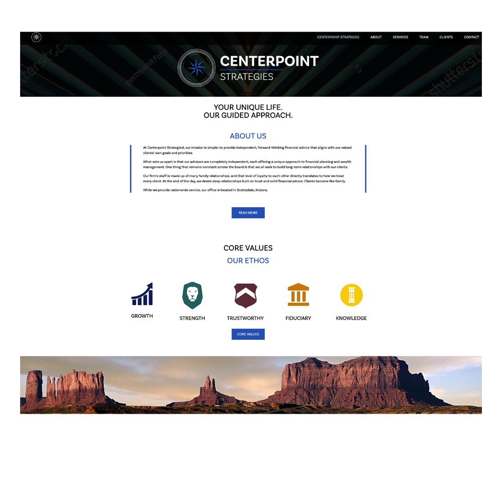
Centerpoint Strategies
2021
New brand expression for Arizona based financial strategies firm, including log, template, coins, and website.
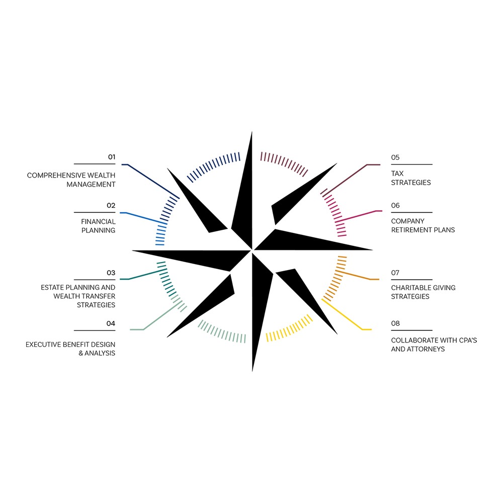
What is the meaning of a 8 pointed star? The eight-pointed star represents a symbol of hope that is surrounded in a circle. Note that number eight is an important one in terms of achieving balance. The Indians from Native America referred to this Hope symbol as Star Knowledge.
The circles show the center of financial life and orbit. The tick marks show movement, momentum and time. The star represents eight points of service, while the morse code show the ethos key words.
the template uses the space defined by the website and
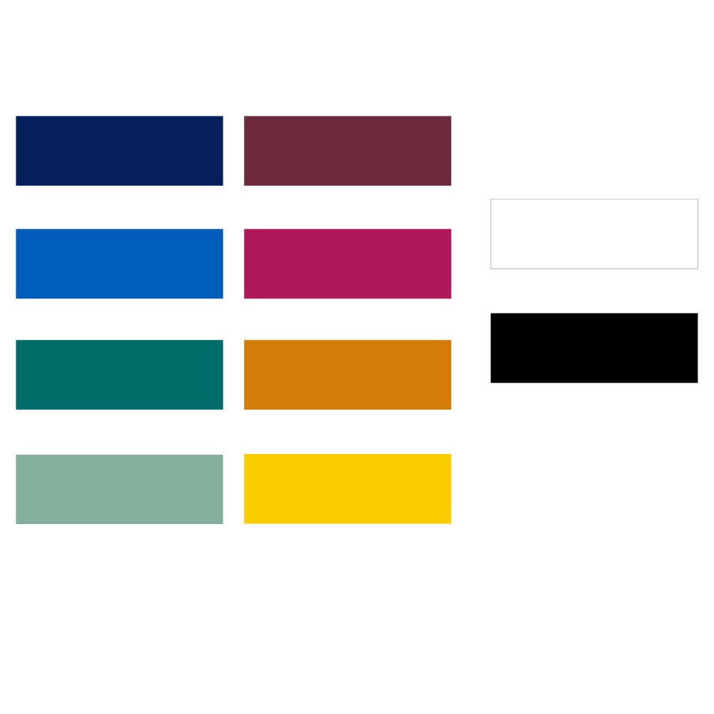
Big Sky blue is the signature color for Centerpoint Strategies. The color is modern and optimistic and rooted in the opportunity of the open sky above. key colors: blue: depth, stability, trust, confidence, calm, peace, competence.
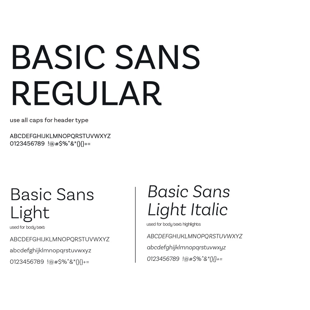
Rounded modern versatile type style.
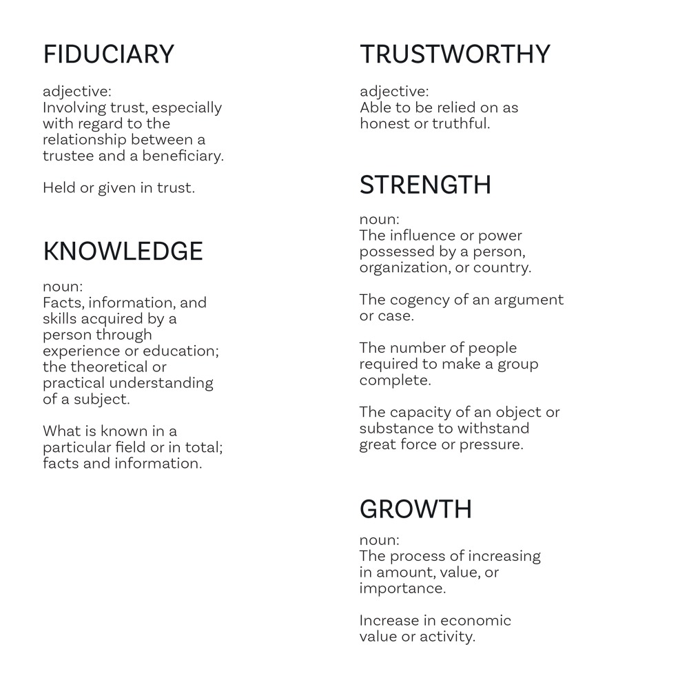
The Ethos and foundation of approach for the firm. All services stem from these five ideas.
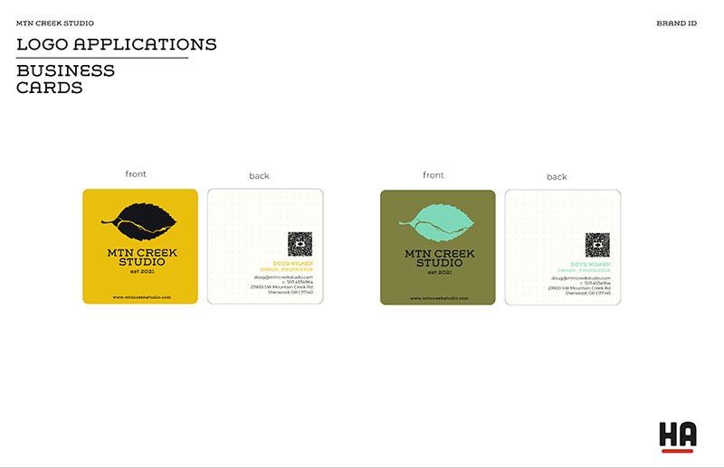
Rounded corners with a premium matte finish in a simple white based card with blue accent. A QR code linking to the contact info was added as well.
Infographic expression of the logo with the eight points of service highlighted.
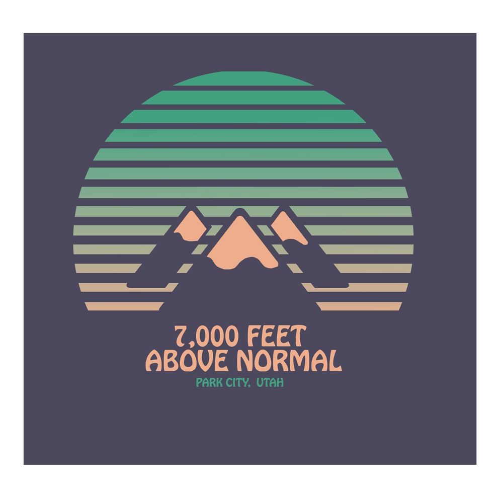
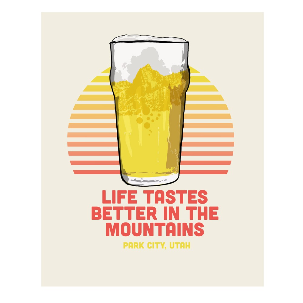
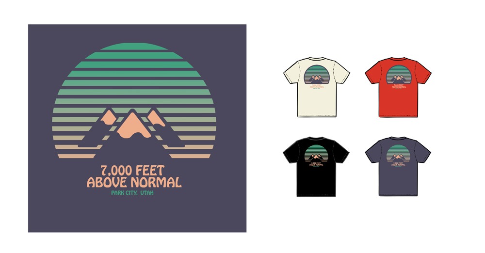
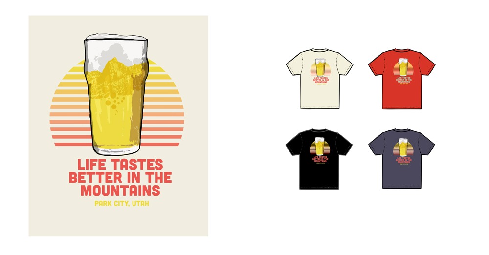
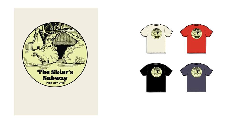
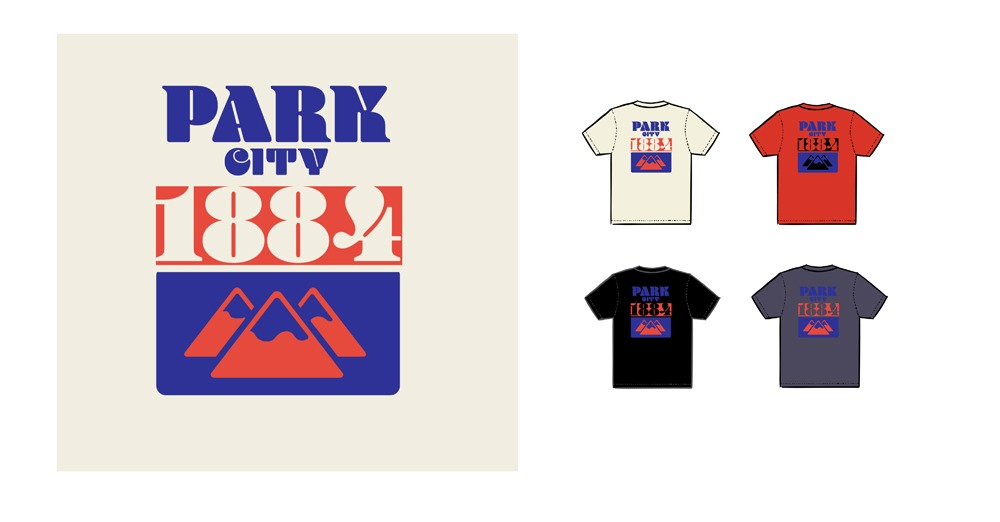
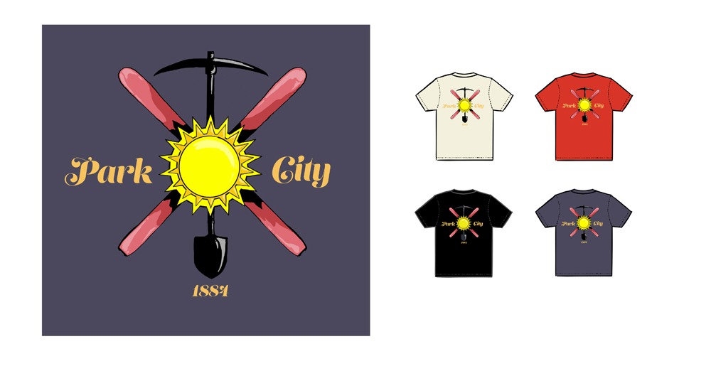
The Corner Store T-shirts
2021
T-shirt for iconic Park City, Utah bar and shop
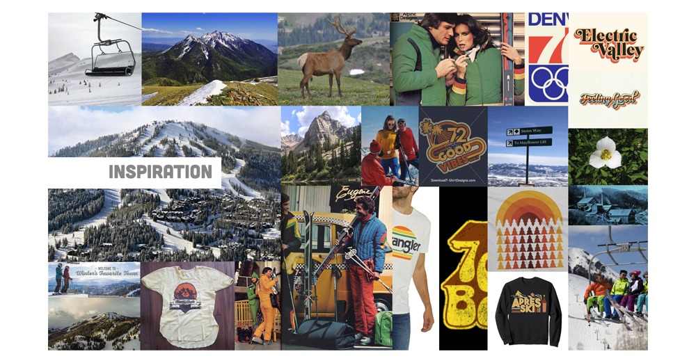
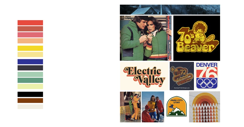
The brief was to take a new look at city t-shirt for Park City with a 70’s vibe and a fun approach that could be sold at the establishment.